In my last blog I quoted Tom Wintringham’s advice that the first lesson to learn was how to take cover. This piece of advice can be applied to survival as well as military personnel and has many aspects. It includes how to find shelter from the weather. It includes how to take cover from gunfire. It covers the difference between cover and concealment and it includes how to move between cover. Some of these aspects have already be addressed in this blog and future articles will cover others. Today I am going to share some reflections on concealment and camouflage.
In 1848 the British Army in India began to use khaki-coloured garments. “Khaki” is an Urdu word meaning “dusty” and the colour was a light beige, tan or dull pale yellow. The pioneer behind this was an officer called Hodson and it is notable that his early correspondence refers to the uniforms as mud or dirt-coloured, with the intent to make his troops “invisible in a land of dust”. Some garments were made by dying white items with tea. Garments that won’t show tea stains are only prudent for a British soldier, of course! Many garments were made from a cotton cloth called “khaki drill” and this name is used for the colour, the fabric and the uniform items issued in it. The British army at the time was a major influence on military fashions and many other nations adopted khaki, particularly for tropical wear.
In 1902 the British Army adopted a new service dress. Woollen cloth is generally not suitable for printing with camouflage patterns, so a single colour was required. (bear in mind the term “camouflage” did not come into use until during the First World War). The colour chosen for the 1902 dress was a hue intermediate between brown and green. Some paint manufactures call this hue “khaki drab” but it is commonly referred to as just “khaki”. Incidentally, the term “khaki” has become virtually useless for describing a colour. Imperial Japanese Army woollen uniforms are described as “khaki” but are closer to an ochre than khaki drab. Just to confuse things further the IJA used khaki drill for summer and tropical wear.
The colour of the new 1902 British Army service dress was also used for the later battledress. It has been described as matching “the colours of heath and forests of the United Kingdom fairly well”. Most other nations adopted uniforms of a similar hue.
It seems to be deeply rooted into our psyche that nature and countryside is “green”. In actuality, a few days of military operations tend to render an area less verdant than before. Artillery, vehicles and boots soon create more mud than lawn. Green is also seasonal in temperate climates. Even in summer green is rare in some rural terrain such as rapeseed fields or ripened wheat. Hodson’s original idea of mud or dirt-coloured uniforms is more logical.
The selection of khaki drab was also based on the assumption that most fighting would be in rural areas. The Spanish Civil War indicated that urban areas would be important battlegrounds. Urban terrain negated many of an attackers’ advantages in aviation, artillery and armour.
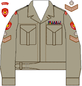
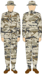
Below is a suggestion of what battledress might have looked like if it had been designed for both rural and urban use.

That urban operations are not exceptional has still not fully penetrated the institutional military mindset. For several decades British troops in Northern Ireland wore dark green DPM. When the US Army tried to develop a Universal Camouflage Pattern at the start of the 21st century it chose the colours sand, grey and green. In practice UCP appeared to be several pale greys that blobbed out into a light man-shape that stood out against most terrain. Equipment such as webbing and pouches that will be used in a variety of environments also tends to be made with green predominating.
If we are choosing clothing for concealment it is most logical that we choose hues that will work well in both urban and rural terrain. Generally this means neutrals such as the duller, lighter shades of browns, beige, greys, yellows and pale blues. Lighter shades counter body-shading and in certain conditions will reflect light from surrounding terrain.
Should you choose monocolour or camouflage patterns? In some environments camouflage can attract unwelcome attention which can be counterproductive. Prudence suggest that you have at least one ensemble of mixed monocolours. In a rural situation natural materials can be added to this outfit to disrupt the shape and better fit in with your surroundings. If you are in an area where there is lots of green there are green things growing you can use. The WW2 Japanese were noted for their effective camouflage but did not widely issue any camouflage pattern items that I know of. Instead they used nets and natural materials over their green or khaki gear
When buying items in camouflage patterns some prudence needs to be exercised. The primary task of camouflage clothing is shape disruption. The size and shade contrast between elements is far more important than the hues used. Many modern camouflage patterns neglect this fundamental, and often come up with all sorts of technical sounding snake-oil to defend this. The British MTP is a good example of a poor modern pattern. At more than a few metres the small colour elements merge and you see an obvious khaki drab man-shape, unlikely to blend with the background unless you get an exact match of hue and shade. Many older camouflage patterns tend to be too green and too dark for many environments, the latter made worse by body-shading. A good pattern needs contrast between elements and needs some of those elements quite light to counter shading and create the illusion of negative space.
You may be better buying some cloth or a garment of a suitable light neutral shade and adding your own pattern. See previous blog posts for ideas.
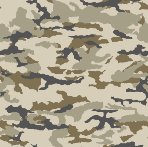
Below is a camouflage pattern and palette that I have been toying with. It is intended for both urban and rural use. In a verdant environment green can be added in the form of natural materials.


Any camouflage pattern on a cloth is only the foundation for your camouflage. You must add 3D elements too. Some of this is local and natural materials. If you are in a forest you might add bracken to your headgear, pack and shoulders. If you move into a wheatfield you dump the bracken and replace them with bunches of wheatstalks. 3D is also provided by textiles. Your cape or smock should include various scraps of fabric sewn to it that disrupt the shape and smoothness of the garment. These ideas have been covered in previous blogs.
The above advice comes with a caveat. Three environments occur to me where there may be alternate choices to the yellows, greys and browns suggested above.
The first is in snow, where predominantly white camouflage may be needed.
The second is in urban environments where red brick is the main building material. Many urban environments use a variety of materials so browns and greys serve well in most situations and do not look out of place near the occasional red surface.
The third is in rainforests, be they temperate or tropical. Brown-based items can work here if they are combined with local materials. This is, however, an environment where green-based camouflage patterns or pale green monocolours may be a more practical choice.