This particular train of thought probably started as I was watching Westworld. In one scene we see a parked truck, as shown below:


Geometric urban camouflage patterns are nothing new, of course. What is notable about this example is the use of obliques, and the size of the elements used. The pattern appeared even more effective on the show than it does in the still. My eye kept losing parts of the shape and I had to remind myself that I was looking at a truck.
I have reached the conclusion that shape-disruption is one of the most important properties of a camouflage, and that this is where so many modern camouflage schemes fail. To hide a man we must first stop him appearing man-shaped.
The other day I happened across a booklet I have called “Camouflage Simply Explained” by Lt.-Col. Cyril H. Smith. Leafing through it I came across a statement that hiding an objects shape required bold patterns. The section on personal camouflage draws from Langdon-Davies, but the pattern illustrated by Smith is different from the one Langdon-Davies suggests for field and forest. As you can see, it uses large, bold elements.


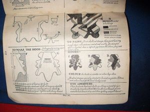


This pattern is similar to those given by Langdon-Davies for rocky and urban terrain. Bold patterns, using proportional large elements.
Smith also addresses the camouflage of RAF aircraft, which also shows bold, large elements. These patterns were used well into the jet age. Similar patterns are used by some Russian ground vehicles.


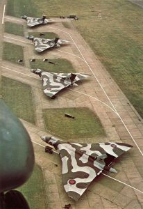


RAF patterns were painted adhering to a template, so all aircraft of the same type should have an identical pattern (although in the early part of the Second World War the pattern was mirrored for even-numbered aircraft).
I don’t know how these schemes were arrived at, but observe:
- Band width loosely approximates the height of the fuselage.
- Bands may branch.
- Bands are oblique
- Bands typically divide a wing or fuselage into between four and eight parts. This may be more on long-bodied aircraft.
Looking for similar camouflage schemes turned up some interesting images:
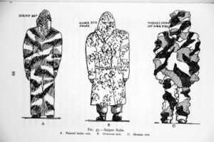

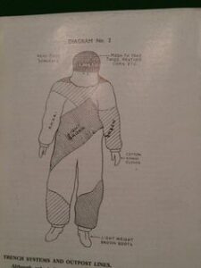


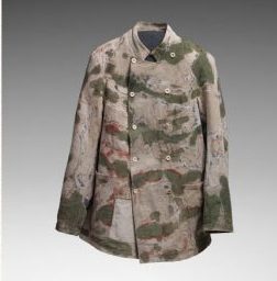


The last three are interesting, since they may be the first ever camouflage jackets known by the term. Created by the artist Louis Guingot, the pattern was called “Léopard”. Only five examples were made. Shows good contrast between the elements and uses natural-looking hues of green and brown. Could teach many latter efforts a thing or two!


Some charming attempts at Langdon-Davies’ sniper suits. He would not approve of the separate eyeholes and pink flesh visible, however!
Curious, I performed a little experiment using a pattern I generated. Like most modern camouflages, the pattern is too green, but will serve to investigate the effects of element size. The same pattern was resized so that it was 250, 350, 500, 600, 750 and 1000 pixels square. Results suggest that even larger elements may be more effective.

