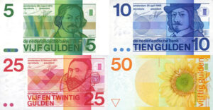
Something that came to my attention on this trip was the similarity between certain Euro notes.
Both the fives and twenties appear a blue colour, the tens and fifties a red.
They look distinctive in the above picture but in practice it was quite easy to confuse these if you were not careful.
Given that the Euro is a relatively new banknote design, it is a little surprising that more thought did not go into its design.
British banknotes, for example, are different colours. £5, £10, £20 and £50s are respectively blue, brown, purple and red. £1 notes were green and the £1 notes still issued by some regional banks are still this colour.
Some series of notes also featured a distinctive simple shape in this colour. For example, the £5 a blue circle, £10 had a brown/orange diamond, the £20 a purple square and the £50 a red triangle. (The current £20 seems to have dropped this feature)
These shapes were designed to further aide the partially sighted. Different denominations were also different sizes. I have been told that the visually handicapped were provided with a little gauge they could use to measure the length of a note to identify it.
Some Canadian notes have tactile markings for the visually handicapped and it is apparently planned for some US banknotes.
It would, however, be more useful if this became a universal feature. Next year the Bank of England plans to issue polymer banknotes. This would be a good opportunity to introduce tactile markings but I expect this will not be exploited.
An even better system would utilize unified braille, catering for partially sighted visitors not familiar with the local system of symbols.
"Ecotopian bills seemed comic when I first saw them. Yet three weeks later I find them more attractive than the greenbacks left in my wallet. Very romantic in style: lush, Rousseau-like scenes, almost
tropical, with strange beasts and wondrous plants. No images of famous Ecotopian leaders—when asked why not, people just laugh. Maybe it’s a consequence of their informal, utilitarian attitude toward money— they bundle it up into rolls and toss it to each other in an offhand manner I've only observed among gamblers."
"Ecotopia" by Ernest Callenbach.